
Every high-performing email started as a test. A/B testing helps you move from gut instinct to proven results, fast.
What should I test?
We've seen brands grow revenue per campaign by 50%+ simply by testing the basics: subject line style, CTA placement, or how products are arranged in an email.
- 🔎 Subject line styles. Curiosity vs direct benefit
- 🔎 Layout approaches. Image-led vs text-heavy
- 🔎 CTA button design. To test which drives more clicks.
The key? Test one variable at a time. If you change headline, layout, and CTA all at once, you'll never know which element actually moved the needle.
Here's what that looks like 👇
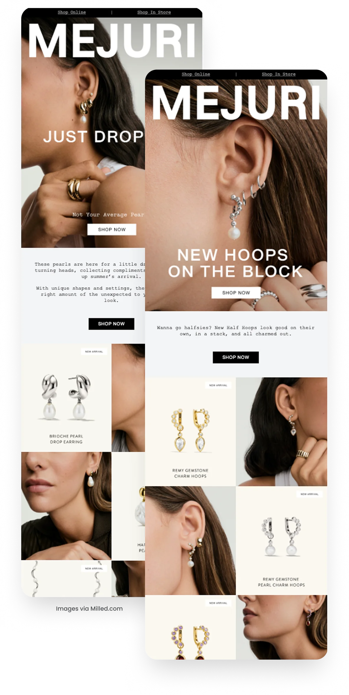
Here's what they're testing:
Both emails are a ‘Just Landed’ style EDM, structured almost identically: bold hero image, short header, sub copy, and product grid below. The main variable? The hero headline and supporting copy:
- Version A: “New Hoops on the Block”: playful, trend-driven copy that highlights the product category directly.
- Version B: “Just Dropped” / “Not Your Average Pearls”: fresher, more dramatic framing that leans into exclusivity and product uniqueness.
Why it matters
The hero header is the first impression in the inbox → click → email journey. By testing headline style (playful/trendy vs bold/exclusive), Mejuri learns what resonates more with their audience without muddying the results.
A/B testing doesn't need to be complicated. Start by testing your hero copy, because it sets the tone for the whole email. Keep everything else consistent, so you know exactly what's driving the win.
Set up your own test:
Next time you build a campaign in Klaviyo: