
A good offer won't save bad design. If your layout doesn't make it easy to scan, click, and act, your email won't convert.
Emails are often read in under 10 seconds. If your design doesn't immediately show value and direction, you've lost them. Strong creative builds trust, improves flow, and increases the chance of action.
The do's & don'ts
- ✅ Use engaging imagery + clear layouts
- ✅ Place your CTA above the fold
- ✅ Design for mobile-first, with accessibility in mind
- ❌ Overload with conflicting messaging or visuals
- ❌ Rely on images alone (ensure to add alt text)
- ❌ Skip mobile preview/testing
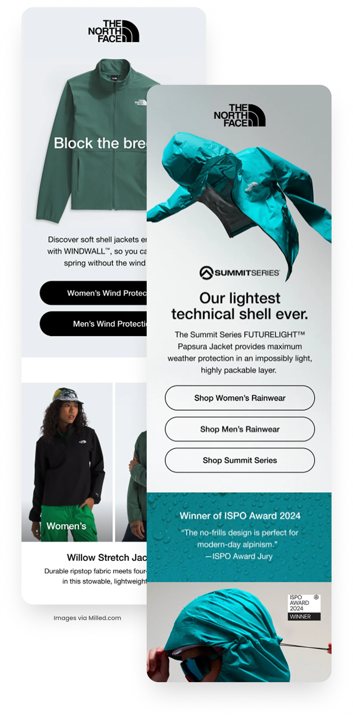
Here's a great example:
Why they work
The North Face keeps their design clean, bold, and product-first. Each email uses striking hero imagery paired with short, benefit-driven headlines that immediately communicate value.
CTAs are clear, above the fold, and product-specific, making it easy to act fast. They also layer in credibility through awards and product features, balancing emotional appeal with rational proof.
The result? Emails that are easy to scan, build trust instantly, and guide the reader to one obvious next step.
How to improve your designs
Next time you design a campaign: